A one-page site for a guitar teacher, built around a single decision
A speculative design for a Leeds guitar teacher: strip the site to one conversion path, and make the first step cost nothing.
An unsolicited concept build. I designed and shipped a complete one-page site for a real local guitar teacher, structured so that every section drives one action: book a free 30-minute taster.
What this is
- A complete, working one-page site — nine sections, responsive, deployed and clickable.
- Built around one conversion path: every section terminates in the same free-taster CTA, which appears seven times.
- Uses credentials as the trust engine rather than reviews — the honest play for a teacher without a review corpus yet.
- Speculative and clearly labelled. Nobody commissioned it, so the live demo says so on every screen and takes no bookings.
The hook
[TODO: why this one. What made you pick a guitar teacher, and this guitar teacher — were you a student, did you find him, did someone mention him? This is the paragraph that turns a spec build into a story, and it's the only part I can't write for you.]
What I can say about the shape of the problem is generic to the category, and true of nearly every independent teacher I looked at. A private tutor's website is usually one of two things: a social profile doing a website's job, or a site that lists everything the teacher can do and asks the visitor to work out the rest. Both fail the same person — the adult who has been thinking about learning guitar for two years and needs a reason not to close the tab.
The problem worth solving
A guitar teacher's site has one job: turn a stranger who is idly curious about learning into someone with a lesson in the calendar. That's it. Not show off the teacher's playing, not explain music theory, not list every genre covered.
Price isn't the obstacle. Skill isn't either. Embarrassment is. The prospective student is an adult who suspects they're too old, or a parent who doesn't know whether their child will stick with it. They're not weighing £14 against £28. They're weighing the risk of feeling foolish in front of a stranger.
So the design problem becomes narrow and answerable: what is the smallest, least humiliating first step you can offer, and how fast can you get someone to it?
Three decisions that drove the build
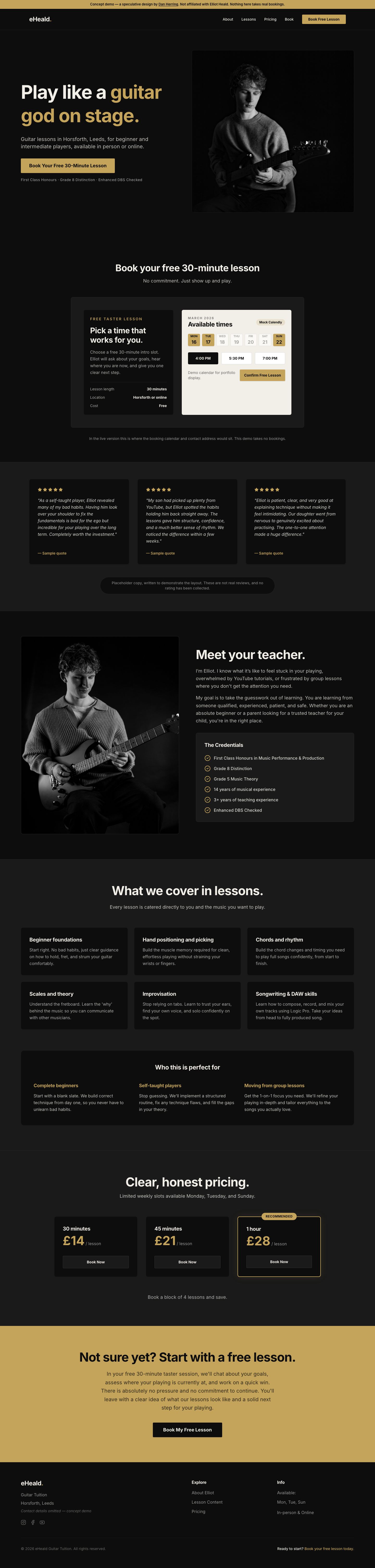
1. One page, one action. A multi-page site would give a hesitant visitor a navigation decision on top of a commitment decision. So there is no second page. The nav is four anchors and a button, all scrolling within one document, and every section ends by pointing at the same free-taster booking. The CTA appears seven times on one page and it is the same CTA every time. There is no competing action anywhere on the site.
2. Make the first step free, and say so before anything else. The hero's button is not "Get in touch" or "View pricing" — it's "Book Your Free 30-Minute Lesson". Putting the zero-risk offer in the primary button removes the calculation the visitor was about to make. Pricing still exists, and sits deliberately far down the page, because price is a question you answer after someone wants the thing, not before.
3. Credentials carry the trust, because reviews can't yet. Most local-service sites lean on testimonials. A teacher early in their career doesn't have a bank of them, and inventing them is not an option. So the trust architecture runs on verifiable qualifications instead — conservatoire-level grades, a degree, and the DBS check that a parent is actually scanning for. Those sit directly beneath the hero CTA, in the position where a review widget would normally go.
How it plays out on the page
1. The booking step comes second, not last
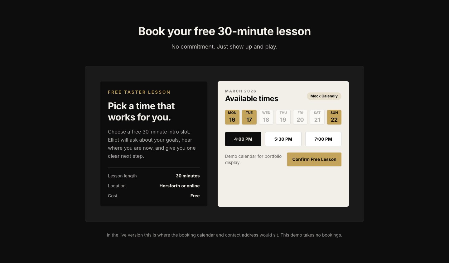
The conventional order puts booking at the bottom, after the visitor has been persuaded. I put it directly under the hero, as the second thing on the page. If someone arrives already convinced (and for a free offer, plenty do), making them scroll past five persuasion sections to act is friction with no upside. Everything below the booking block exists for the people who weren't ready at first glance.
The booking panel itself is deliberately concrete: length, location, cost, laid out as three plain rows. Thirty minutes. Horsforth or online. Free. The specifics are the reassurance.
2. Objections answered in the visitor's own words
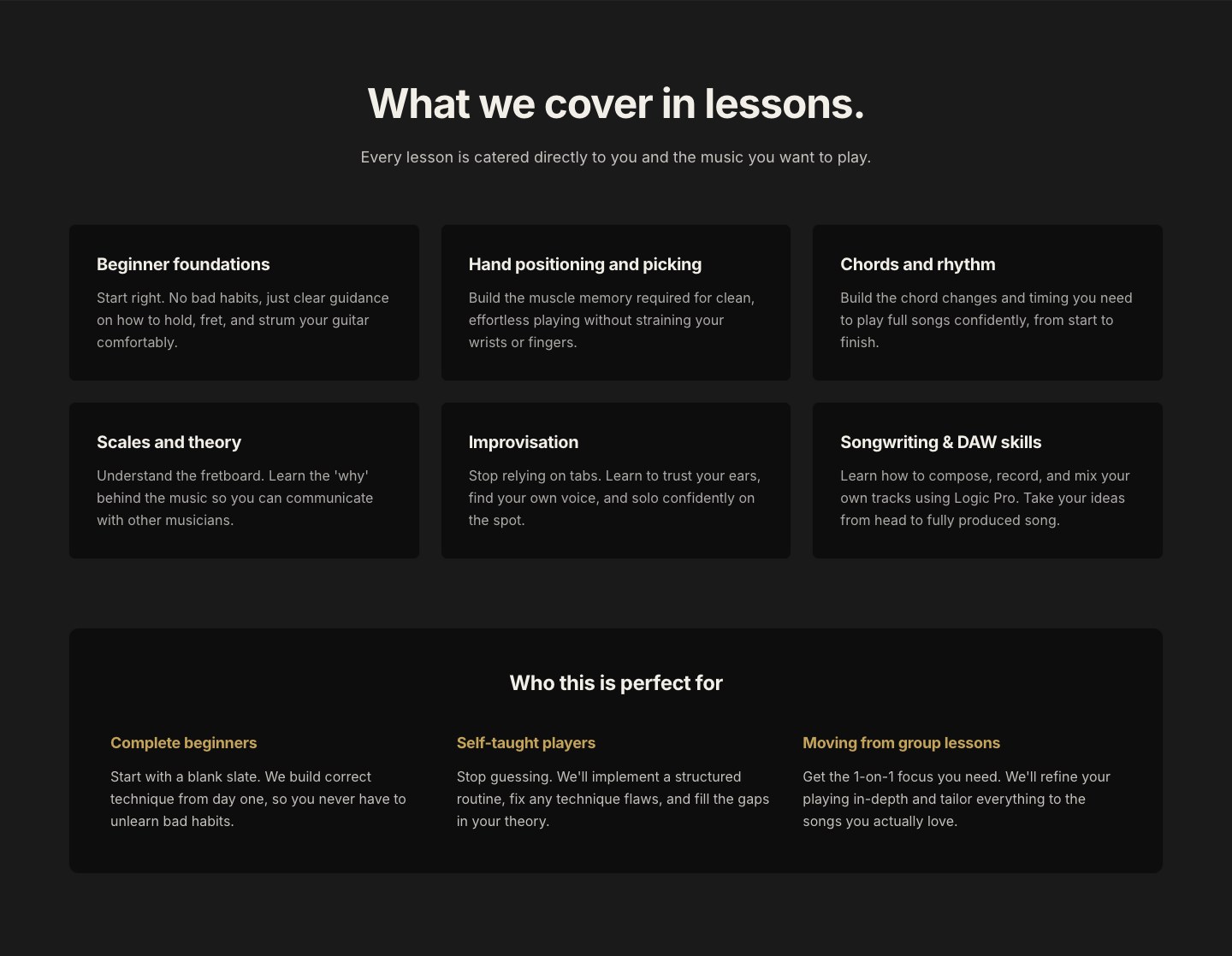
The "Who this is perfect for" block names three states the visitor might be in: complete beginner, self-taught and stuck, or coming from group lessons. Then it answers the specific fear inside each one. The self-taught player's fear isn't "can I learn", it's "have I already ruined my technique". So that card says the habits are fixable rather than promising to start from scratch.
3. Pricing as a reassurance, not a hurdle
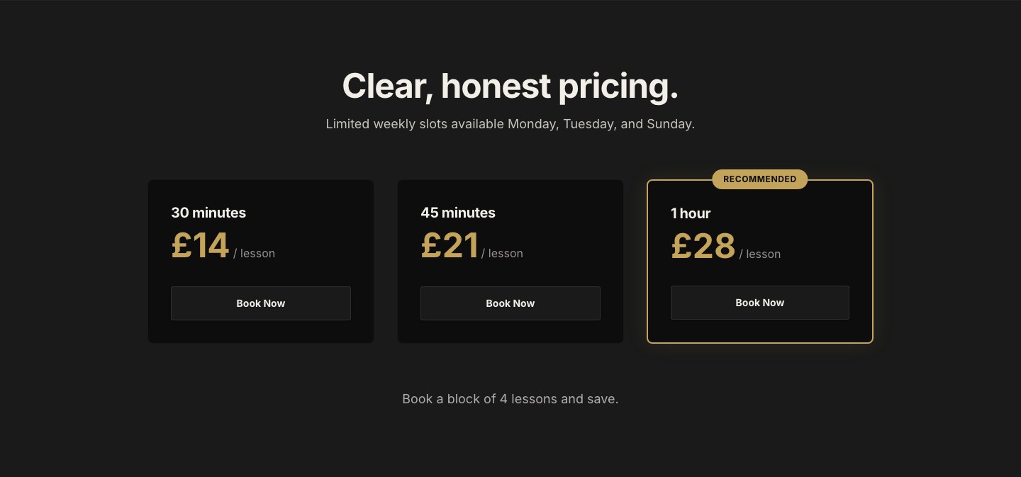
Three durations, three prices, one marked as recommended. The hour is the recommended tier because it's the length at which a lesson stops being a taster and starts being a habit — the same logic that governs any recurring service. The section is titled "Clear, honest pricing" and does nothing clever, because at that point in the page the visitor is checking affordability, not being sold to.
4. The whole page, top to bottom
What isn't real, and why the demo says so
This was never commissioned. That creates an obligation, because the concept carries a real person's name and a real business's details, and a polished site is very easy to mistake for the genuine article.
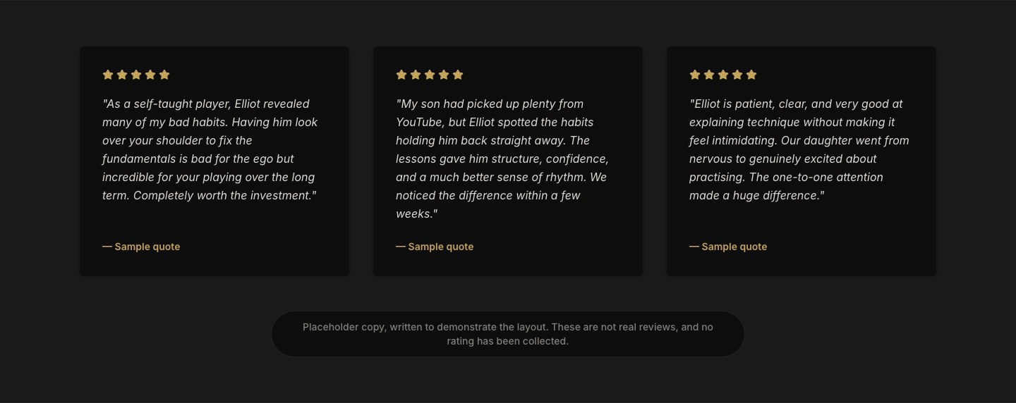
So the deployed demo is labelled on every screen: a persistent banner naming it as a speculative design, not affiliated, taking no bookings. The contact address is stripped out so the demo can't send mail to someone who never asked for it. The page is set to noindex so it can never surface in a search for his business or compete with his own presence. The three testimonials were written to show the layout, like any placeholder copy, so they're labelled as samples, with the invented "Rated 5.0" badge removed entirely.
None of that weakens the piece. A concept that's honest about being a concept is a better argument for hiring me than one pretending to be a client win.
Where it stands
The build is complete and deployed. What it hasn't had is the only test that counts: being shown to the person it was designed for.
[TODO: has Elliot seen it? If not, that's the next move and it's worth saying so plainly here — a spec build that never gets shown is a portfolio piece; a spec build that gets shown is a pitch.]
[TODO: if you do send it, record what came back. A "no thanks" is still a result worth publishing, and it's more interesting than silence.]
What I'd do differently
Ship the ask with the build. The site was finished in May and sat in a folder. The work was never the bottleneck — the build was done in days. What was missing was sending it. If I built this again I'd write the covering message in the same sitting as the last component, while the thing still feels alive.
[TODO: one more, in your own words. The honest second lesson — whether that's about spec work generally, about picking the subject, or about what you'd cut from the page.]