Diagnosing and rebuilding a yoga studio's customer journey
A four-month strategic audit & partial rebuild of a Kirkstall yoga studio's funnel — from first visit to recurring membership.
Diagnosed and rebuilt the WellNest route from first visit to booking: collapsing 12 membership options to 3, 9 navigation items to 5, and adding a "Start Here" page that didn't exist before.
Outcomes
- Collapsed 12 membership options to 3 named tiers and a 9-item nav to 5 — cutting decision paralysis at the two highest-value pages.
- Built a new "Start Here" page from scratch as the single path for first-time, nervous beginners.
- Rewrote the homepage hero around concrete copy and 500+ five-star social proof, placed at the point of decision.
- Shipped five of six structural changes live; the 12→3 pricing change is designed and held in the founder's hands.
The hook
WellNest is a beloved local yoga studio in Kirkstall, Leeds. It's a converted church with 500+ five-star reviews, the kind of place people quietly tell their friends about. But the website it relied on to find new members was trying to do everything, and doing nothing well.
The homepage asked first-time visitors to make nine navigation decisions before they'd even decided whether to walk through the door. The membership page asked them to make twelve pricing decisions before they'd taken a single class. The product was great. The funnel was leaking everywhere.
I'd been a member at WellNest for a year before I noticed it from the other side. As a regular, the friction was invisible to me. I already knew which class I wanted, when, and at what price. Once I looked at the site as a stranger would, the gap between the studio's quality and the experience of finding it for the first time became impossible to unsee. So I reached out to Harriet, the founder, and offered to fix it.
What followed was a four-month strategic audit and partial rebuild. I diagnosed five core problems on the site (plus two bonus ones), proposed a system to fix them, and shipped the changes that mattered most to the live website.
The problem
WellNest's website needed to do one job: convert first-time visitors (people who had never done yoga) into booked beginner-class attendees, and from there into recurring members. The site as it stood was structured to do the opposite: present every option to every visitor at once, with no path through.
The audience that mattered most was a specific archetype: the intimidated beginner. Someone who has been thinking about trying yoga for months, has finally landed on the WellNest homepage, and is one decision away from booking a class or closing the tab. This person already wants yoga. They just need to be guided in. Every additional choice the site forces on them raises the chance they leave.
Scope
In scope: the route from first homepage visit to first booked class, and the path from first class to first membership. Specifically the homepage, navigation architecture, Memberships page, Classes page, and a new Start Here page.
Out of scope: the booking platform itself (Squarespace's native system stayed), the brand identity (logo, name, visual identity remained), the RISE Children's Learning Hub (separate brand, separate audience), and the nurture flow for existing members (already converted, not the bottleneck).
A quick primer on yoga studio economics
For service businesses like WellNest, recurring revenue is everything. A member paying £40/month is dramatically more valuable than the same person buying a £100 class pack three times a year. You get predictable cashflow, predictable demand, predictable retention. The membership IS the business model.
The hero product is the tier that creates a real practice habit, because habit creates retention. For yoga, that benchmark is roughly twice a week. Frequent enough that the practice sticks, realistic enough that a working person can actually hit it. A four-class tier is too light to build a habit. An unlimited tier is too big a leap for someone fresh off their first class. The eight-class tier sits in the sweet spot.
Class passes are the trap. They feel safer to the customer ("less commitment") and convert at a higher rate ("just one click"). But every class pass purchased is a missed membership: a customer trained to think transactionally about a service that only pays off when used routinely.
This is the lens I'm applying in everything that follows.
The diagnostic frame
Three lenses ran through every decision in the audit. Naming them upfront makes the rest of this case study readable as a coherent system.
1. Paradox of choice. Barry Schwartz's principle: when everything is available, nothing gets chosen. The cognitive cost of choosing rises with the number of options. Past a certain threshold, customers stop picking the best option and start picking nothing at all. WellNest's homepage demanded nine navigation decisions before a visitor knew what the studio actually was. The memberships page demanded twelve pricing decisions before they'd taken a single class. Most visitors made the easiest choice available: leaving.
2. Jobs-to-be-done. Every page, nav item, and CTA was held against a single diagnostic question: what is the one job this is hired to do? Pages that did three jobs poorly were redesigned to do one job well, or absorbed into other pages, or cut. The About page was hired to build trust, but trust-building belongs on the homepage, not behind a click. The Memberships page was hired to convert visitors into recurring members, but it was buried twelfth in the navigation. Once the job of each element is named, the call to keep, transform, integrate, or delete becomes a matter of arithmetic.
3. Point-of-decision evidence. Trust signals, social proof, instructor credibility, and pricing logic should appear at the moment a buying decision is being made. Putting them on a separate page that converts no one is wasted effort. WellNest had instructor profiles isolated on a page few visitors found, when those same faces and credentials would do real work on the Classes page itself, at the point of booking. The 500+ five-star reviews lived mid-page, when they should have been in the first three seconds of the homepage.
The improvements
Each improvement maps to one of the three diagnostic lenses, and each lens is fundamentally about a psychological bias the website was triggering or failing to use.
1. Less stuff converts more
Paradox of choice → decision paralysis
The two pages doing the most commercial work were also the two pages overloaded with options. The navigation forced first-time visitors to make nine decisions before they understood what WellNest was. The Memberships page asked them to choose between twelve pricing structures before they'd taken a single class. Both were prime triggers for decision paralysis. The customer's brain reads "too much to process" and exits.
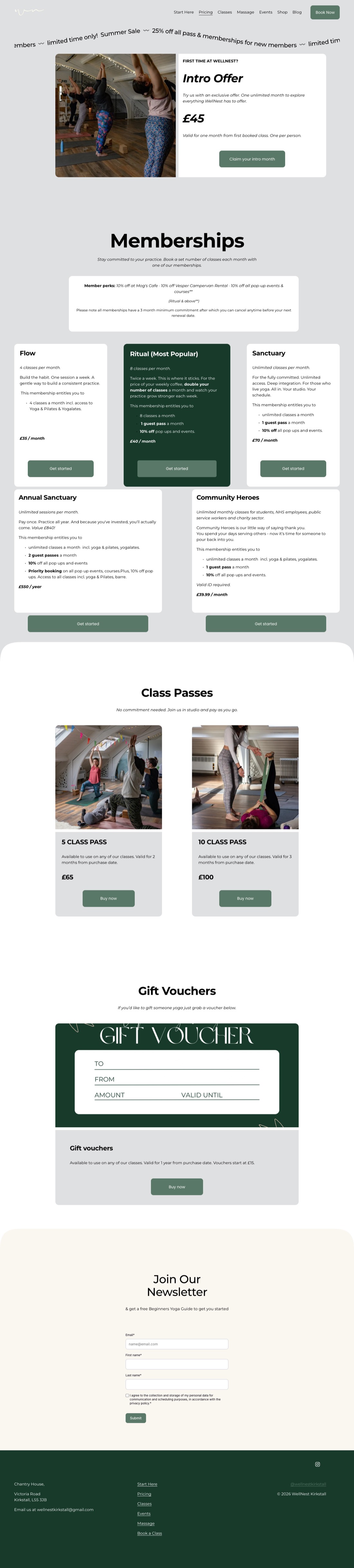
The fix was structural compression. Navigation collapsed from nine items to five (Start Here, Classes, Memberships, More, Book Now), with three lower-priority items absorbed into a More dropdown and the unrelated RISE Children's Learning Hub moved off the main site entirely. Memberships were reduced from twelve options to three: Nava (4 classes/month, beginners), Nitya (8 classes/month, the hero), and Yogi (unlimited, for committed practitioners). Class passes were removed entirely. Each tier was given a Sanskrit name and a one-line identity, replacing twelve generic price tags with three meaningful identities.
Old Navigation (9 Items)
New Navigation (5 Items)
Old Memberships (12 Options)
New Memberships (3 Tiers)
2. First-time visitors need a path
Jobs-to-be-done → fear of inadequacy
The site had no entry point for the customer who mattered most: the intimidated beginner who'd never done yoga. Every page assumed the visitor already knew what they wanted. There was no version of "I'm new, where do I start?" anywhere on the site. The bias keeping these visitors out was specifically the fear of looking inexperienced or out of place.
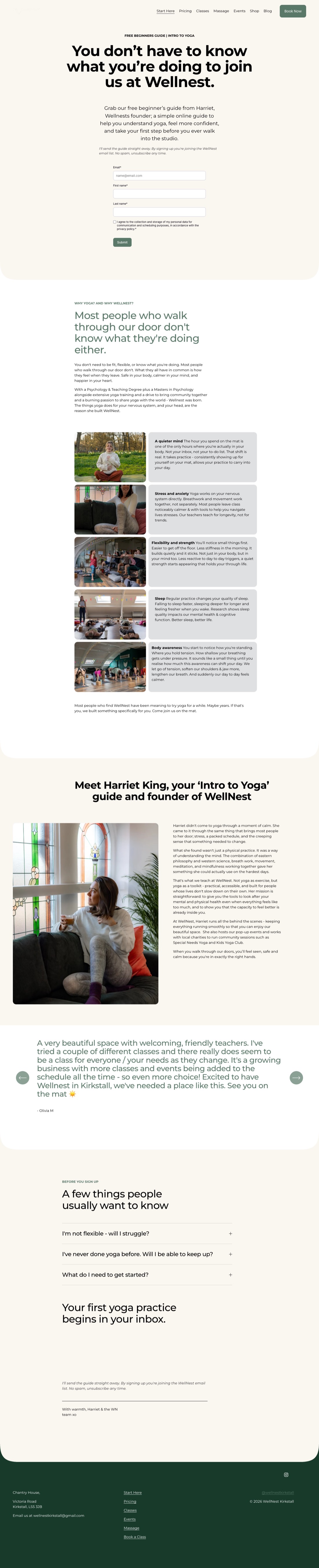
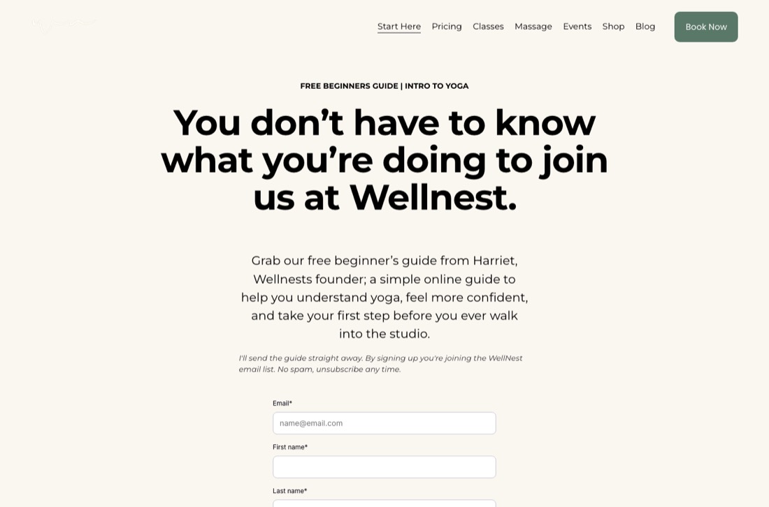
The fix was a new Start Here page, designed as the singular path for first-time visitors. The hero headline ("You don't have to know what you're doing") directly disarms that bias. Below it: a Why Yoga section that frames outcomes in concrete feelings, a step-by-step walkthrough of what actually happens when you arrive (you're greeted, you grab a drink, you find a mat, nobody judges you), Harriet's bio as the friendly human face of the studio, a gallery of the converted-church space, the address with a map, and a single CTA: download the Yoga Start lead magnet and claim a free first class.
3. Trust at the point of decision
Point-of-decision evidence → social proof + identification bias
WellNest's strongest trust signals were invisible or in the wrong place. The 500+ five-star Google reviews lived mid-page, when they should have been in the first three seconds. Instructor profiles, the actual reason people choose a yoga studio (people pick a teacher more than they pick a class), were isolated on a page few visitors found. The hero copy ("Taking care of your mind, body and soul") was undifferentiated wellness wallpaper. The hero image (an empty studio of mats and bolsters) showed that yoga existed here, but didn't show who it was for or how it would feel.
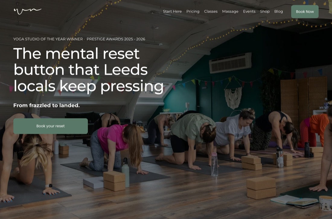
The fix was placing trust at the moment of the buying decision. The hero headline became "The mental reset button that 500+ Leeds locals keep pressing." Concrete and sensory, with the social proof built into one sentence. The hero image was swapped for a relatable beginner after class, smiling, so visitors could instantly picture themselves in the outcome (identification bias, hooking the visitor's self-image). The Google reviews widget moved into the hero block. Instructor names and faces were embedded into the Classes page itself, at the point of booking. Hygiene fixes followed: a "Cosy Winter Retreat" event listing still showing in March was removed, along with other outdated content.

The shipped system
Five of the six structural changes are live on the WellNest site today. The sixth, the membership reduction, has been designed and presented, and is currently held in client review.
1. Memberships: 12 → 3 (in client review)
The most dramatic proposed change is also the most commercially consequential: collapsing twelve purchase options into three named tiers (Nava, Nitya, Yogi). This is a significant pricing shift on top of a design change, so Harriet is taking the time to weigh it. The audit's job was to identify the problem clearly, design the system, and put the decision in her hands. Pushing wasn't part of the brief.
2. Navigation: 9 → 5 (shipped)
The new top-line nav (Start Here · Classes · Memberships · More · Book Now) replaced the original nine-item bar. Three lower-priority items live in a More dropdown. RISE Children's Learning Hub moved off the main site entirely.

3. Start Here page (shipped)
A new page, built from scratch, designed as the singular entry point for first-time visitors. Hero, Why Yoga grid, walkthrough, Meet Harriet, gallery, location map, and lead magnet CTA, all live. The case study's headline new asset.
4. Homepage hero (shipped)
The old generic hero ("Taking care of your mind, body and soul") and empty-studio image were replaced with concrete copy ("The mental reset button that 500+ Leeds locals keep pressing"), a relatable beginner image, and a Google Reviews widget. Small in real estate, large in conversion logic.
5. Classes restructure + homepage schedule (shipped)
The Classes page was reframed as a lean style explainer, with the dense paragraph descriptions cut. More importantly, the live weekly schedule was embedded directly on the homepage. Visitors now see what's on, when, and with which instructor without navigating at all. The schedule is now the strongest visual element on the homepage.

6. Hygiene fixes (shipped)
Outdated event listings and broken biosite links were removed. The kind of fix that signals the site is actively maintained.
Also in flight: a short series of SEO and authority-building blog posts is being written, targeting high-intent local search terms and positioning Harriet as the go-to wellness voice in Leeds. Same diagnostic frame, applied to organic discovery.
Outcomes & next phase
Phase 1 was diagnosis and structural rebuild. Phase 2 is measurement and funnel completion. Five structural changes have shipped, but no quantitative data has been gathered yet. Measuring the impact of Phase 1 is the first job of Phase 2.
What will be tracked once data starts flowing: lead magnet downloads and free-class claims (via Mailchimp), homepage and Start Here page traffic plus bounce rates (via Squarespace analytics), and organic search visibility from the three SEO/AEO articles in flight as early signals of authority growth in local wellness terms.
The original target (three first-time visitors per month booking the redesigned £47/month membership) is paused until Harriet greenlights the Memberships restructure. The funnel work shipping now (Start Here, lead magnet, simplified nav) is what makes that target reachable when she does.
Phase 2 (designed, not yet shipped): a structured newbie package as the bridge between the free first class and the £47/month membership. Currently the missing rung between trial and recurring revenue.
[TODO: Insert testimonial or quote from Harriet once collected.]
[TODO: Insert real data as it comes in — lead magnet downloads, Start Here → free class conversion, homepage bounce rate change, organic ranking for local wellness terms.]
What I'd do differently
Two things, both about pace.
Don't push. The Memberships restructure is the most dramatic proposed change in the deck, and the most commercially consequential. Earlier in my career I'd have shipped it and called it done. With Harriet, I held it. She hadn't said no. But it's her livelihood, and a pricing change that big belongs to the founder. The consultant's clarity on a problem isn't the founder's, and trying to convince is almost always slower than easing in.
Get the numbers first. My instinct is to read sites psychologically (what biases are being triggered, what friction is being created). That's still where the value lies. But the first job, before any of it, is the numbers. How many land, how many click, how many book, how many stay. In wellness and other founder-led services, asking takes care because revenue and retention can feel personal. Without the numbers though, every recommendation is a hypothesis dressed up as a diagnosis.